
A phrase commonly heard around the game store is "table quality" or "game quality," referring to an army's paint job. Whichever way you say it, the meaning is the same, 'this is an army that performs best on the tabletop, not sitting on a shelf.' And that's ok. Not every model you paint has to be aimed at achieving golden demonhood. The 9 months it takes to paint a Slayer Sword winner simply isn't a reasonable approach for each model in your army. However, by utilizing a few key techniques, a clean, crisp and table ready army can be painted in no-time.
I've been playing Biel-tan Eldar for eight years now, having collected somewhere near 4,000pts worth of minis. This article is going to focus on that collection, and the basecoating, highlighting, and modelling techniques that will turn heads and garner praise wherever you take your army.
Let's take a look at some Dire Avengers and what makes them pop on the battlefield.


There are some gamers who hate the assembly phase of putting together minis. "It's boring and monotonous!" they say. They're looking at it the wrong way, assembly is your first chance to personalize your miniatures and make them unique. For instance, these two Dire Avengers, for all intents and purposes regular squad members. However, the simple cutting of the ammo clip from the shuriken catapult and posing of the arm to be reaching for a new clip or ready to slam one home adds a level of unique detail to the minis that gives them a realistic battlefield feel.
When constructing new models ask yourself three questions:
1. "What would this model be doing as they prepare/get to battle?"
2. "What would this model be doing before reaching hand-to-hand combat?"
3. "What would this model be doing in combat?"
I answered question number 2 by saying the Dire Avengers would be shooting the crud out of something and reloading as they did so. Remember, nothing was altered besides the clip being removed from the gun, that maximum conversion for minimal effort!


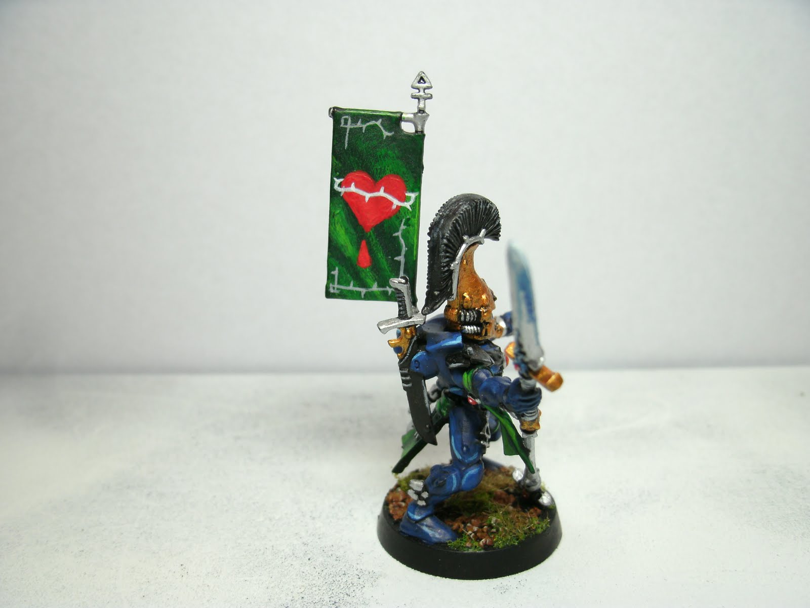
Next, let's take a look at the squad exarch and a few features that helps him stand out on the table top.
His paint scheme is relatively simple: prime black, base coat 'regal blue,' broad highlight 'enchanted blue,' and final highlight 'ice blue.' His green features are primed the same, but base coated with 'dark angels green,' broad highlighted with 'snot green,' and final highlighted with 'scorpion green.' How to go about applying the colors is to paint on 1-2 thin layers of the base coat, until you get a nice uniform coat with no darker areas (one coat might be too thin and show through to the primer, appearing darker than the rest of the coat). Next, a broad highlight of a lighter shade is applied by using a standard brush around armor plate edges. Apply liberally, covering approximately 1/2 to 2/3 of the desired area. It also helps to layer an extra coat nearer to the armor plate edge where your final highlight will be to give the effect of gradation and shading between highlights (this isn't actually shading, but a quick trick to look like you did). Finally, add the top-most highlight with a fine detail brush (standard will do with a light hand) and paint on a nice clean line, following the contour of the plate edge. If you smudge or mess up, don't worry, just trim the smudge off by applying the lower level coat (i.e. to trim 'ice blue' use 'enchanted blue' to paint off the offending misstep). This is also a great technique to use simply to gain sharp lines, paint the final highlight and then use the color underneath it to repaint the highlight edge getting the sharpness to the line you want.

It's safe to say that over eight years my painting technique has increased and that my early models look a bit shabby next to my latest creations. This is a common occurance amongst gamers and should be viewed like touching up paint chipping and battle damage.


This is the first wraith lord, painted about four years back. The base painting was good, but it lacked levels of highlighting that I didn't start utilizing until later in my hobby career. A quick addition of a broad 'snot green' highlight and final 'scorpion green' highlight (pictured above) quickly gave the model the added pop it needed to stand out on the table top. When viewed from a gaming perspective, highlights on top of a clean base coat go a long way.


A few years later and I was ramping up the painting technique on my second wraith lord. This time I applied the fundamentals of wet-blending on green surfaces to achieve a broader highlight and increase the overall depth of a surface, instead of just picking out the edge detail. How I did this was to apply my broad 'snot green' highlight to the center on the highlight focus (in this case the center of the wraith lord's head). To do this I would dip my brush in water, remove most the excess, and then get some paint out of my pot. The paint is slightly watered down at this point and applies in super thin coats (you can also use a wet palette for this technique, see last month's post for more details). Starting with my brush at the very edge where I would like the broad highlight to stop, I dragged the brush to the highlight apex (where the 'scorp green' highlight would go). Since the paint is slightly wet it want s to bead and condense where the brush last touched the model. Ending the brush stroke at the highlights highest point puts most of the broad highlight's density there and blends the highlights together. After doing four to five of these broad highlights I repeated the same process with the 'scorpion green' toplight, starting it midway into the 'snot green' as I had when applying that highlight onto the base coat. To complete the shaded highlight, I would apply a clean final highlight of the highest highlight color, picking out an edge or contour surface.
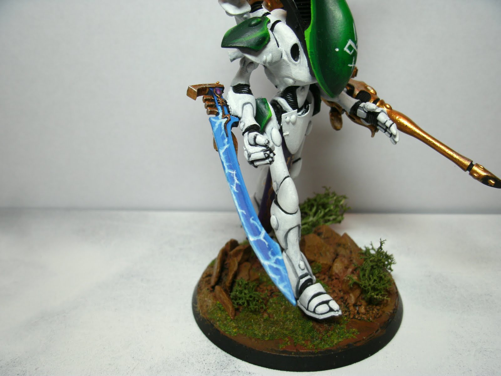
What really makes this model stand out is his wraith blade. To do this I used the same technique described above, but started on an 'enchanted blue' base and layered a broad 'ice blue' to the blade's border. Next, I applied an 'ice blue' base for the lightning by painting a thin line where the lightning would flow on the blade. To highlight the lightning I mixed a 1:1 shade of 'ice blue' and 'skull white' applying it less liberally along the lightning base, lightening more towards the branches in the lightning and its thickest sections. Another mixture of 2:1 'skull white' to 'ice blue' was applied following the same principle, but even less liberally than the previous highlight. To finish the lightning I took pure 'skull white' and hit the thickest areas of the energy and its most prominent points.
Now that we've covered two highlighting techniques let's look at another table ready technique, camouflage.


To give my rangers a suitable chance at hiding in the terrain I first applied a base layer of 'catachen green' to their cloaks, gloves, and shoe coverings. With the base down I selected two colors to act as the first levels to the camouflage: 'bestial brown' and 'scorched brown.' Once the paint was on my standard brush I wiped it on my palette until there was a sparse amount and then hit the model in random areas with quick, light strokes (this will give the camo a "thatching" appearance). Having gotten a suitably random appearance to the first layer of browns I then added a higher level to 'bestial brown' and 'scorched brown' with 'snakebite leather' and 'vermin brown,' respectively. Instead of painting inside the lower level color like most highlight/shading, I used the same technique as before, but allowed the brush stroke to go outside the bounds of the lower color. What this did was not only add a level of highlight to the color, but also continued the random appearance of the camo, making it appear more authentic.


Notice also the higher density of shrubbery on the models' bases. Though it can be heart breaking to cover up your hard work, the addition of such details places the models in their preferred element. Rangers would spend most of their time hiding in cover, not standing on a flat piece of earth!

Another group of cover loving Eldar are the Striking Scorpions. For these models I'd like to focus on their gemstones, and accessory highlights (gold and black).


Gemstones are a prominent feature on most Eldar models, but I especially enjoy them on the Striking Scorpions. The eye-catching lime green of their suits lends itself to be perfectly complemented by a nice dark purple. As you can see in the exarch above, I chose purple for many of the detail colors on the model (gemstones, eyes, beads). To paint the gemstones I based 'liche purple' over my black primer, and wet blended a layer of 'warlock purple' 2/3 onto the gem. I decided that my highlight would concentrate to the bottom right of the gem, therefore, the 'warlock purple' was painted to concentrate there by dragging the wet blend to the bottom right. Next I applied a top highlight of 'tentacle pink' to the very bottom right edge of the gem. "But wait! GW doesn't sell 'tentacle pink' anymore," you say. No worries, simply mix a 1:1 of 'skull white' and 'warlock purple' to make a suitable shade. To complete the gemstone, place a fine dot opposite the apex highlight in the top left corner with 'skull white.' I've also found that a thin line on the edge of the stones top corner then a gap to the dot makes a brilliant gem effect.


Highlighting metallics and black can sometimes be a tricky procedure, and I must admit, I avoided it for some time. However, it can be quite simple. To highlight a metallic, let's use the scorps' 'dwarf bronze' take the base color and mix it 1:1 with 'mithril silver.' Apply in 1-2 thin coats as you would another highlight, along edges and raised contours. To finish the highlight, paint pure 'mithril silver' at the apex of the highlight.
Next, to do black, paint a first highlight of 'codex grey' onto edges and contours and then apply a final highlight onto that of 'fortress grey.' Black can be tricky because it's highlights stand out incredibly well and any imperfection is easily seen. Once again, if a mis-stroke of the brush is made an easy way to remedy this is to go over the grey with 'chaos black,' essentially erasing the error. I typically clean up my highlights after their applied on black by going back over with 'chaos black' and "trimming" their edges, making them crisp and straight.

Painting white can be a nightmare, let's see if we can take some of the stress out of it.


The more esoteric an Eldar unit is, the more I feel impelled to use it. It's true, sometimes I think I'm the only one that uses Shining Spears and Swooping Hawks. Ha ha, probably not though. Still, both units offer up an excellent opportunity to paint dazzling colors. In the case of Shining Spears it's white.


The problem with white, however, is that it takes a ton of layers to cover up an even moderately light base coat. With my shining spears I did prime the riders black, but kept the jetbike hood detached and primed it white (it's broad surface is a nightmare to build up from black>grey>white).
For the riders I painted a 'fortress grey' base coat over the black prime. It took two thin coats to get a nice light grey. Next I painted a layer of 'skull white' over the most prominent surfaces of the armor. Note that I skipped deep grooves, leaving them grey to act as shadow. Because white is difficult to highlight (white is usually the top most highlight), grey shadows adds needed depth to the model. I layered on thin coats of 'skull white' until the armor was suitably white at its highest points. I did apply 'skull white' in recessed areas, however, that was done conservatively. With that finished, 'codex grey' was applied in the deepest recesses where the darkest shadows would form. Though this technique is not the easiest, it is very effective at achieving the white paint scheme that will have your models turning heads! (A side note: finishing with a spray of matte coat helps to prevent the models from becoming dirty.. white shows dirt and hand grime extraordinarily well).
As I said, Swooping Hawks are a unit hardly even seen fielded in most competitive Eldar lists. Admittedly, for the points, hawks aren't a unit choice worth taking in most cases. However, against low armor save units like infantry guard or orks, Swooping Hawks can dish out enough damage to pick off specialist squads in your opponents back field.. and maybe even a tank or two.


The headpiece for the squad is definitely the squad exarch. For this model I wanted to represent the hawks' wings as they're described in the fiction, as, "shimmering with every color of the rainbow." To do this I picked colors in a gradient and applied a base coat of each in succession. Next I chose a shade lighter for each wing and highlighted the inner portion of the feather, leaving the out the original darker base. A final highlight of yet a lighter shade in a sharp inner line finished the highlight on each feather.


Each squad member (with the exception of two) have a unique patterning of colors on their wing feathers. When the squad is grouped up their wings combine together to form an impressive array of stunning color.


I will admit that before starting work on my Harlequins I was rather intimidated by them. The 'Eavy Metal guys did such a good job on the studio models, I worried that I would be able to do the minis justice. One of the most daunting tasks was the precision painting required to do the harley's signature diamond patterning.


The first Harlequin I painted (pictured above) was my first try at the diamond pattern. To do this I first painted a 'liche purple' base coat onto the areas I wanted to place the pattern. Next I applied a starter diamond in 'snot green.' With this diamond placed I then painted an adjacent green diamond below it so that their points top and bottom apexes connected. I repeated this all the way down until I had filled a complete column of diamonds, then repeated the process next to the first column, having each diamond touch the diamond above it with its top most point and the diamond next to it with one of its lateral points. In this way, the initial diamond and its column acted as a guide to the placement of the next column of diamonds and so on. To give depth to the diamonds I wet blended 'warlock purple' and 'snot green' in the top 2/3 of each diamond, and finished with a sharp top highlight of 'warlock purple' and 'snot green' to the top two edges of each diamond.


For the remainder of the squad I wanted to differentiate them with a number of different painting and design styles. For the harlequin above I painted diamonds that were breaking apart as they traveled up her leg and sleeve.


For this harlequin I wanted to paint a diamond pattern that faded in gradient from one diamond to the next. The diamonds are paired so that a purple and red are adjacent and a teal and blue diamond are adjacent. This creates an interesting visual pattern where the diamonds seem to combine and form a larger shape with multiple colors.


Still focusing on diamonds I began to push myself to create even more challenging patterns. In this harlequin I made a pattern that faded across the width of his jacket. How I achieved this was to use the same base coat for all the diamonds, but add increasing levels of highlight on the lighter diamonds. The end result is that they appear to fade to the darker base coat.


Deviating away from diamond variants I experimented with free hand drawn details. On the harlequin's mask is a star field I made by painting white onto the black base and then adding 'sunburst yellow' to the brightest/largest stars. I also added scroll work details to his gloves, pants, and other black areas by starting with a 'snot green' base and finely highlighting with 'scorpion green.'


The opus of the harlequin squad had to be the enigmatic Shadowseer. For him I wanted to pull out all the stops and put as many of the afore mentioned techniques to use. He has gradient shading on all his ribbons, loin cloth, and clothing, as well as diamond fading on his hood and backpack. One of the special details I incorporated into this model was the plaid-diamond pattern on his leg. To do this I painted him the safe as I did with my first harley, but added a very fine line of yellow in between select diamonds. As a final touch, I also modified the shadowseer's basing, by pinning some of the rocks and gluing them on their ends it appears as though the psychic might of the shadowseer is radiaitng from him and even affecting the ground beneath his feet!

A special thanks to my brother, Andrew, for providing lighting for the photo shoot. The pics look great!
No comments:
Post a Comment